
Payments
module

Overview
Liberu is a platform that connects brands — including Heineken, Adidas, and Coca-Cola — with content creators to produce marketing campaigns. Once a creator finishes their part of a project, they need to get paid for it — and that process, which sounds simple, actually involves several steps: generating the payment request, uploading legal and tax documentation, going through internal review, and finally scheduling the payout (which is processed outside the platform, through an external provider). The payments module is the piece of Liberu that manages that entire chain, and it's used by two very different types of people: The creator, who needs to upload their documentation and know, at any given moment, exactly where their money stands. The internal payments team, who needs to review and approve that documentation at scale — between 100 and 200 payments a month — and decide when a payment is ready to be scheduled. This case documents two full redesigns of this module — not as a straight line, but including one hypothesis that turned out to be wrong, how I caught it, and how I fixed it.
Client:
Liberu
Year:
2026
Category:
Product Design
/
Internal Tools
Location:
Mexico City


✦ My Role
I led this project end-to-end — research, flow, and UI — across two full redesigns. The initial version documented here as the starting point already existed when I joined the team; from there, every decision in the following iterations was mine.
✦ The Challenge
Every payment at Liberu went through the same process, and for a platform moving hundreds of payments a month between two very different types of users, that process was working against both of them at once.
For creators, the core problem was a constant lack of clarity: nothing in the interface reliably confirmed whether they'd finished what was asked of them, or what came next.
Key interface elements could disappear from view once the process started.
Pending requirements weren't visible until users stumbled onto them on their own.
On top of that, the entire process was designed for desktop only, even though Liberu's creators managed nearly everything from their phone — making an already unclear process harder to complete on the one device they actually used.
The direct result was a steady stream of questions reaching the payments team — "did I finish uploading everything?" — and payments that stalled simply because the system never made clear something was still missing.
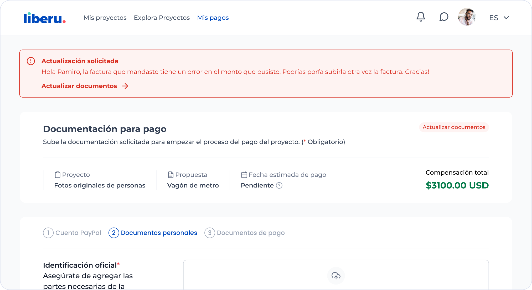
[Image: the "Payment documentation" wizard screenshot]
For the internal payments team, the problem was different: not uncertainty, but an operational load the tool wasn't built to handle.
Managing each payment meant leaving the overview entirely, one case at a time, with no way to move between cases without losing their place.
Reviewing a document meant leaving the platform altogether, since files could only be viewed after being downloaded.
At 100 to 200 payments a month, this made review slow by design, and left the team with less and less room to give a real answer whenever a creator actually needed one.
These weren't two isolated problems — they fed each other. When a creator didn't understand their own status, they ended up asking the payments team directly, adding to a review process that was already slow; the more requests piled up, the slower payments moved for everyone, reinforcing the same uncertainty on the creator's side. Left unresolved, this combination started showing up publicly, with creators openly questioning whether Liberu paid on time.
This strain didn't stay contained within the payments module. A creator without a clear answer about their status didn't always turn to the payments team — often, they went straight to their project's PM instead, adding a stream of repeat questions to a team that wasn't equipped to handle them. And that same accumulated distrust later reached the recruiting team, which faced more resistance trying to bring new creators onto projects, as the platform's reputation took a hit over a problem that was, at its core, a design one. Fixing this one piece — the payment process — wasn't just about improving a screen: it meant untangling friction that was already being felt across several teams at once.
✦ My Approach
Since both problems fed into each other, the solution couldn't just be about making one screen nicer — it had to address both ends: the lack of clarity for creators, and the payments team's lack of operational capacity.
I started with the creator side, since that's where most of the questions reaching the payments team originated. I redesigned the entire process for mobile, with guided steps that always showed what was still missing — removing the "did I finish?" question that used to constantly interrupt the team, and reducing payments that stalled for no visible reason.
Solving that exposed the next problem: the team still didn't have the capacity to handle the real volume. Each case was managed separately, with no way to move between payments without losing their place, and every document had to be downloaded before it could be reviewed. I proposed a side panel that opened when a payment was selected, avoiding the need to leave the overview to handle each case.
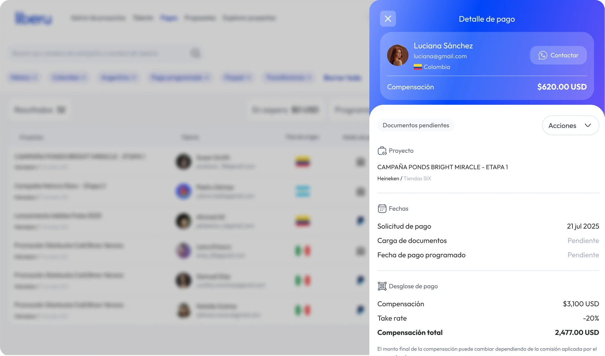
In production, at real volume, this solution didn't work. I'd validated it with a small batch of payments, and it seemed sufficient there — but compressing all the information into a narrow space meant that, at scale, reaching the data the team needed instantly required constant scrolling. I'd validated a high-volume solution with a sample that didn't represent the real workload.
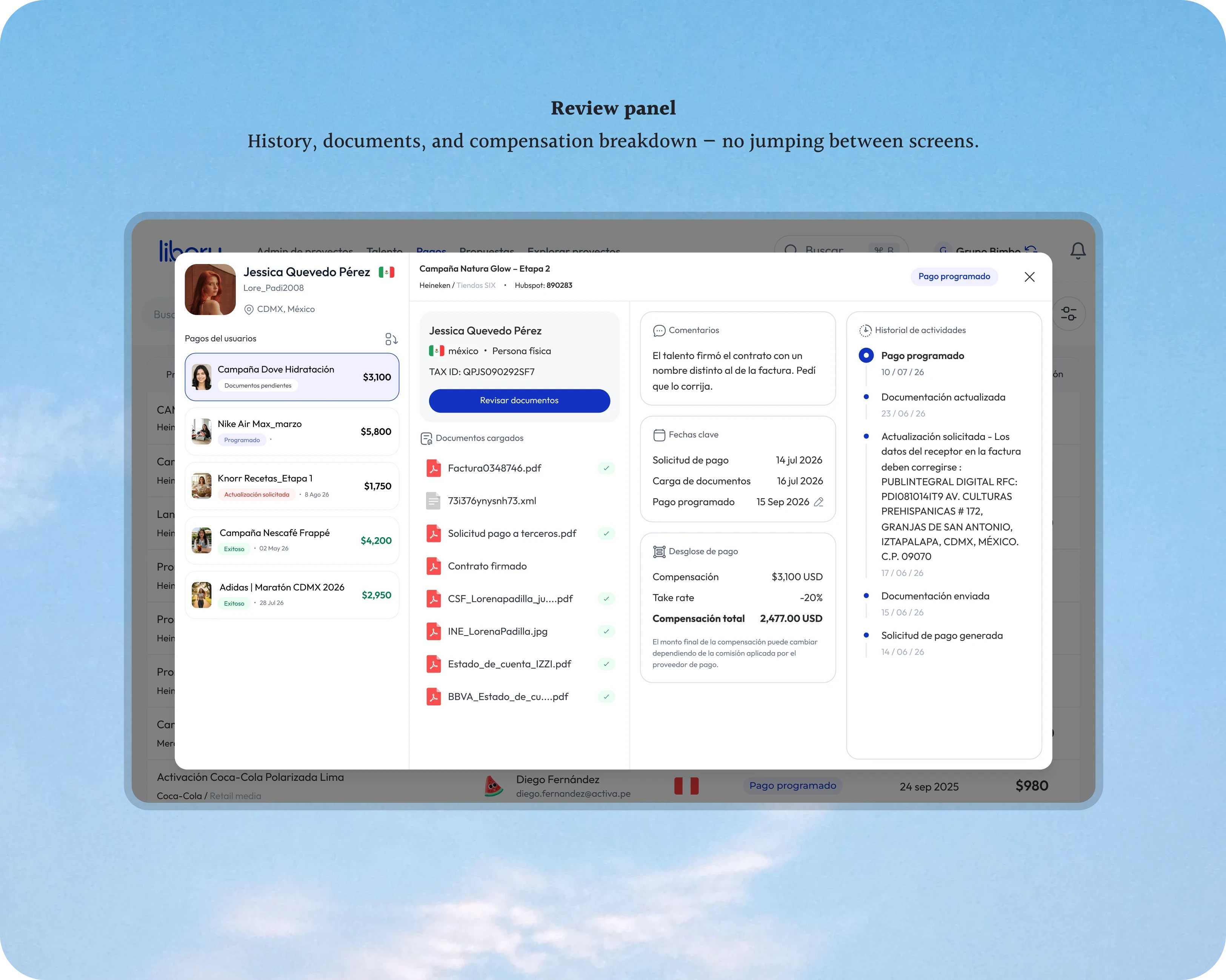
The final solution was a near-fullscreen review panel: all the information visible with no scrolling required, navigation between a creator's payments without leaving the panel, and a built-in document viewer that removes downloading entirely. On top of that, I added one more adjustment following the same logic: the reasons creators were asked to fix something were, in most cases, the same handful of reasons — so I turned those into a predefined, selectable list instead of something the team had to type out manually every time.
Alongside this, a third finding emerged. A simple request from the payments team — being able to see all of a single creator's payments in one place — revealed that a significant share of creators had recurring projects, and with every new payment, they re-uploaded the same ID, the same proof of address, the same banking details the team had already validated before. I confirmed this directly with creators:
That's where Payment Profiles came from: creators verify their documents once and reuse them for every future payout, and the team never has to re-validate what it had already approved — one design decision solving the same problem from both ends at once.
In the end, no single piece solved the problem on its own — mobile, the review panel, and payment profiles only work as a solution together, because the problem was never one isolated screen: it was the certainty missing on both sides of the platform.
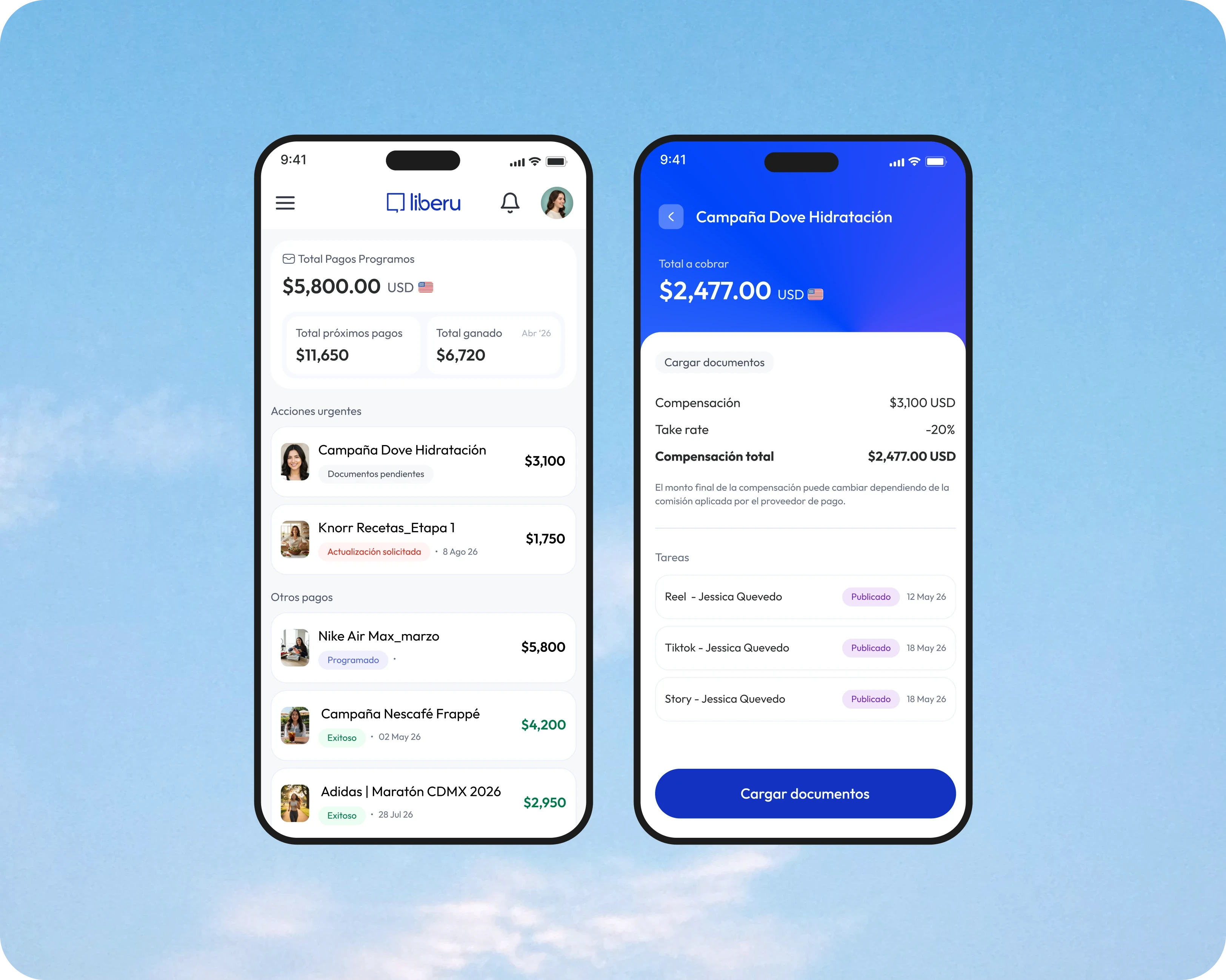



The Result
Breaking the uncertainty cycle didn't just improve the payment experience — it gave the payments team real time back, and gave creators something to trust. Fewer questions to chase down, reviews that take seconds instead of minutes, and a process that finally lives where creators actually work: their phone. The following figures were shared directly by the payments team, based on their day-to-day experience — not instrumented analytics.

